
Media Literacy Exercise
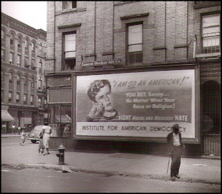
The comparative perspective of my selected images is that of wealth and Caucasian based advertisements in predominantly poor, African-American communities. This centers on the irony of billboards and their erected location. When I look at both of these photos two questions come to mind. In “At the Time of the Louisville Flood,” why is there a brand new billboard marketed toward white America, projecting wealth and status during the Great Depression, in a community that appears predominantly African-American and poor? Not to mention recent floods that left so many homeless. And in “Billboard,” why is a young white boy proclaiming racial and religious acceptance/tolerance to an African-American community? When attempting to answer these questions it’s important to consider image “codes,” as well historical perspective. By understanding the historical periods, the context and objects within the image find meaning, or literal purpose. Through finding purpose the images produce social perspective.
Considering the historical context of “At the Time of the Louisville Flood”(1937), by Margaret Bourke-White, it seems her goal was to capture irony in American advertising during the Great Depression. At first glance our eyes naturally focus on the billboard in the background. The billboard lighting is bright, white, and jumps off the darker line of African-Americans framed in the foreground. It states, “World’s Highest Standard Of Living,” and “There’s No Way Like The American Way.” The line of African-Americans in front of the billboard appear dressed in general poor/working-class clothing, that’s withered or needs to be washed. This aspect of “costume” provides our understanding for their economic and environmental struggles, verses the expendable income of the white family in a new car, with their expensive clothing, happy-go-lucky attitudes, and spunky pup.
In a mini-biography I read about Margaret, “At the Time of the Louisville Flood” is described in performance as, “…The car’s occupants are oblivious to the gathered people, and is about to, figuratively, run them over. The contrast of economic realities in depression-era America is eloquently encapsulated”(Orville). Through this visual description it’s understood that the gap between the poor and wealthy was vast during the period. Declaring that the wealthy were “oblivious” to their troubles, and on the verge of “running them over.” This relationship between the background and foreground paints the separate classes, with the huge billboard and it’s messages literally towering over the hungry line of citizens.
The facial expressions of the visible faces scream of troubled times, mixed with exhaustion of survival. This conclusion is based on the “codes” of the image. In the “How We Negotiate the Meaning of Images” essay, Sturken and Cartwright explain, “The “smiley face” that emerged in the 1960’s has largely been understood as a symbol of happiness. This symbol, which proliferated on buttons and T-shirts, also inspired the common emoticon practice of using punctuation in e-mail to signify and smile J. Yet what a smile means depends on context. Is the little blond boy in The First Murder smiling or grimacing, and how does the context help us to determine the meaning of his expression”(Sturken/Cartwright, 27)? Taking everyday life of the people in the photo into consideration, there seems very little to be enthusiastic about. This historical context tells the viewer these people aren’t sad because someone died, or a few people are just having a bad day. Most likely they’re tired, hungry, depressed about their underwater city, and under stress concerning where they’ll get their next meal. This expression of grief is also supported by the ironic position of the billboard in the background.
From an optimistic perspective maybe the “American Way” billboard was built for inspiration during hard times. At the same time why would this inspiration have to be “white,” especially in an African-American community? The billboard seems to project “whiteness” as the ultimate goal, or what all Americans should strive to become. Richard Dyer states in his essay “On the Matter of Whiteness,” that “Research-into books, museums, the press, advertising, films, television, software-repeatedly shows that in Western representation whites are overwhelmingly and disproportionately predominant, have the central and elaborated roles, and above all are placed as the norm, the ordinary, the standard”(Dyer, 35). Is that what’s taking place in this image? Is the billboard “setting a standard” for American life?
“Billboard”(1948), by John Vachon has many similarities to the Louisville Flood Image. The most obvious relationship is the main focal point of the billboards. This billboard reads, “I AM SO AN AMERICAN! YOU BET, Sonny…No Matter What Your Race or Religion! FIGHT Racial And Religious HATE. Institute For American Democracy.” The community in this image also appears predominantly African-American. Similar questions come to mind. Why is a young white boy advertised in an unrelated social context? One reason might be to gain the acceptance of the African-American community for their political party. The billboard is ironic in that the image projects a message of general equality that should really be displayed in a “white” community. Instead, this billboard represents a bold miss-truth about racial equality and tolerance in our society, “sweet-talking” the community for political agendas.
Once again the billboard is the first thing that grabs our attention. It’s as if the billboards are what the actual pictures were taken for, but then taken from a distance to get a view of the urban landscape as a piece of social commentary. The images almost say, “Why would these billboards ever be here?!” In “Billboards” the angle of the image helps to explore the terrain and show multiple “codes,” or examples, setting the image in an urban African-American community. It is because of these two factors, the apparent African-American based communities, and untreatable “white” advertisements that we discover irony through our understanding of a social and historical context.
Notes
“At the Time of the Louisville Flood” Margaret Bourke-White (1937)
Framing: “Medium-Long Shot,” “Eye Level.” The line of people frame/create depth with the billboard in the background. “Simplicity” is found in the line of people, and the background billboard.
Angle: Neutral, straight on.
Focus: (2 points of focus) The billboard in the background, and the line of people in the foreground.
Lighting: Neutral, natural lighting.
Costume: General “working-class” apparel; warm, layered winter clothing.
Setting: Urban landscape.
Performance: The line of people seem to be waiting for something; possibly food, or transportation (city buss).
“Billboard” John Vachon (1948)
Framing: “Long Shot,” “Eye Level.” The city seems to frame the billboard. It’s almost as if the city surroundings are a form of social commentary on the billboard itself. “Simplicity” is used to bring our attention to the face of the young (white) boy on the billboard.
Angle: Camera left (frame left), directional.
Focus: The city and its people push focus onto the billboard. The camera puts literal focus on the face of the small white boy in the billboard picture.
Lighting: Neutral, natural lighting.
Costume: The pedestrians are dressed in what appears to be general working-class attire.
Setting: Urban landscape. “Simplicity” through the billboard standing out.
Performance: The people of the urban setting appear to be walking around their neighborhood, normal activity.


